Pie charts autopadding
I've been hacking on the Pycha autopadding feature lately and, as most things I write here, I'll try to summarize the tricky parts so I can understand them in a couple of months. As a side effect, I hope you enjoy this post.
In current Pycha versions there is a padding option but it is not what you expect. The current padding represents the space between the limit of the graphics area and the chart area. The labels and ticks are drawn in this space. What this means is the programmer has to manually adjust the padding in order to make the labels render correctly. When you are using pycha for drawing one or two charts in an environment under your control this is not a big issue. When you draw lots of charts from wild data sources, autopadding helps a lot.
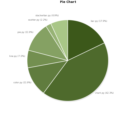
In Figure 1 you can see old style pie charts where we had to manually adjust the padding to make the labels fit. As a side effect the pie was not centered in the graphics area. Here the padding options are: {'top': 0, 'right': 10, 'left': 70, 'bottom': 0}. Imagine what happen if the dataset changes: we would probably need to change the padding.
So, what exactly is autopadding? Well, it's the feature that lets pycha compute the labels and ticks area automatically. Now the padding that you specify is real empty space.
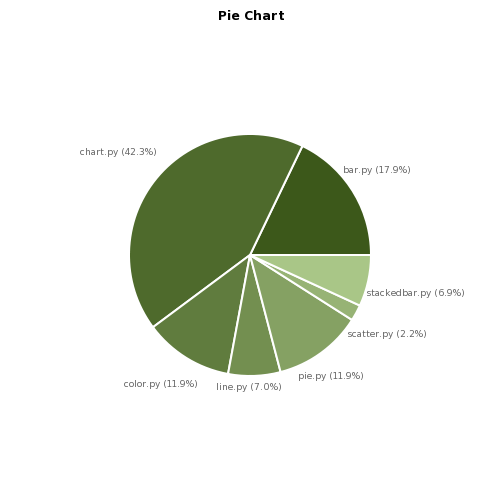
For most of the charts that pycha supports this feature is not very difficult. Except for the pie charts. In this case, it took me a while to get it working and the results, while good enough, are not perfect.
In figure 2 you can see such results. As you can see the pie is smaller now and the slices are ordered in a different way. The order really matters and I will probably add an option in the future to indicate the starting angle (now is 0) so there is a small degree of control left to the programmer. Note that this time the four paddings are equal to zero.
Let's describe the problem: given a rectangular area (width and height) and a list of tuples made of a label and an angle, compute the circunference radius and the label positions so that the pie area is maximized and the labels do not override the pie.
For each label the angle associated with it is the angle that split its pie slice into two slices of the same side. If you have the initial and final angle of each slice (as I do) computing this angle is as easier as summing both and dividing by two.
Step 1. So the first thing I do is compute the center of the area and the bounding boxes of the labels. Any decent graphics library has a function for that and Cairo is no different: cairo_text_extents.
Step 2. Now for each tuple in my label-angle list I draw a ray that starts at the center of the chart and goes into the direction given by the angle. Remember that a rect can be defined with a point and an angle.
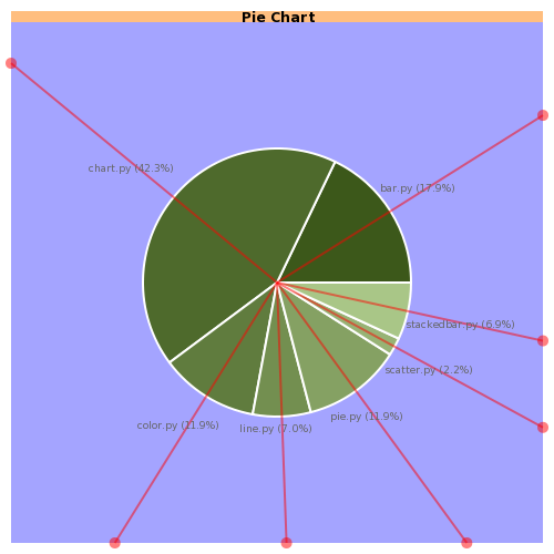
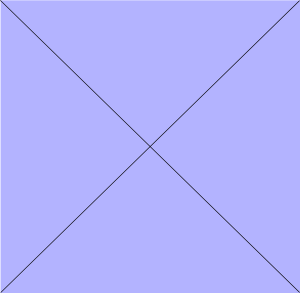
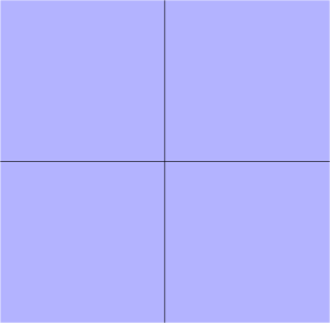
Step 3. I calculate the intersection of these rays with the rectangle that defines my graphics area (drawn in blue in the Figure 3 because debug mode is enabled). Clipping is not useful here since I want the coordinates for every intersection, the rays are not drawn in the final result unless debug mode is enabled. In order to make this computation easier I divide the area in four parts delimited by the two diagonals of the rectangle. Every ray is defined by an ecuation of the form y = mx + n where m is tan (angle) and I know which of the four sides of the rectangle the ray is going to intersect bases on the angle. As every side of the rectangle is also defined by a very simple ecuation, all I have to do is solve an ecuation system for each ray.
Nice. We have now a center and a bunch of rays and intersection points. We also have bounding boxes for the labels. Now I have to place each bounding box with two constraints:
- Its center lies on its associated ray
- One of its side lies on one of the sides of the big chart rectangle
Step 4. It's easy to guess what side of the bounding box matches with which side of the chart rectangle. A little bit of trigonometry will do the rest.
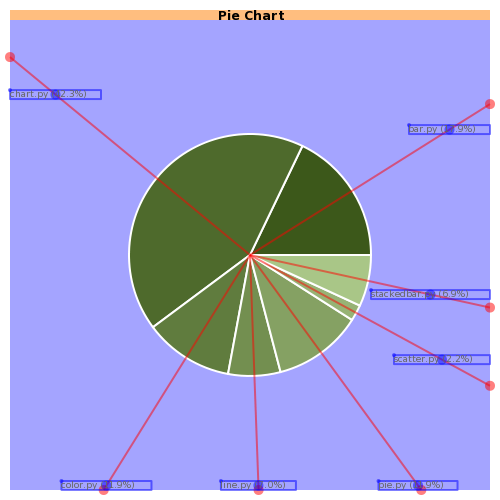
Step 5. Ok, now I have all the labels, or more correctly, their bounding boxes, positioned in the chart rectangle, as far as I can from the center. Now the maximun radius for the pie is the minimum of the distances from the bounding boxes to the center. For every bounding box there is one side that is closer than the others to the center, so the distance we want is the distance from that side to the center. Again, having divided the area in those four parts makes this step this easier. In our example shown in Figure 5 the label that restricts the pie radio is the one that reads "stackedbar.py (6.9%)".
The good news are that we have achieved one of our goals: compute the radius of our pie chart. The bad news are that was the easy part. In the second round of our algorithm we are going to move the labels bounding boxes as close as we can to the pie. Otherwise they don't look good and the conection between the slice and its label is lost. As you may guess all the labels can be moved closer to the center except for one. That's the label that gave as the radius of the pie circunference.
Step 6. So let's try to move the labels. For this task I will divide the chart rectangle in four sides but this time I'll use two perpendicular rects, one horizontal and one vertical. So I'll get my circunference divided in four quadrants. For each label I'll compute the intersection of its ray and our pie circunference. Remember that now we know its radius.
Step 7. For each label place one corner of its bounding box in the point computed in step 6. For the first quadrant this corner is the left down corner, for the second quadrant it's the right down corner, for the third quadrant it's the right top corner and for the fourth quadrant it's the left top corner. This is a feasible position but it doesn't look very nice so we will try to improve it.
Step 8. For each label draw another circunference with the same center as the pie circunference and the radius equal to the distance between the center of the bounding box and the center of the circunference. Now let's compute the intersection between this second circunference and the ray of the same label. Voilá, that's the point where we are going to move the center of the bounding box.
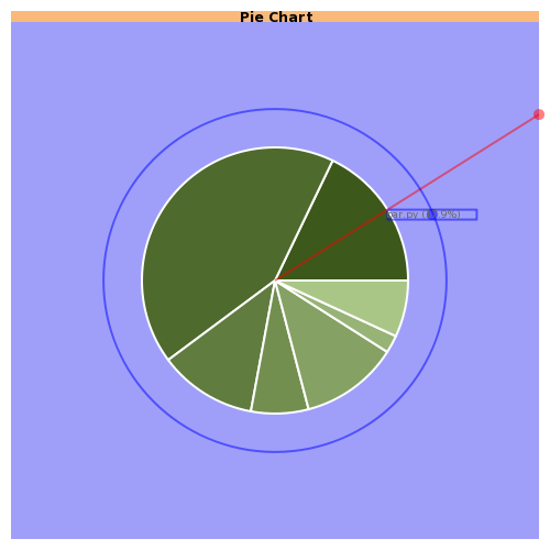
So that's the end of the algorithm, the labels are now positioned closer to the pie circunference but as I said before, it's not perfect since for those labels that are near the top and bottom side of the circunference the label could be closer than it is. I may have used a soft computing algorithm that moves the bounding box along its ray until touches the pie circunference but that would be slower.
By the way, I'm using a named branch for this feature and hopefullly it will get merged into the main branch for the 0.7.0 release of pycha.